Earthy Vibrancy in Home Colour Schemes (2026 Trend Guide)

HILL HOUSE - RESIDENTIAL INTERIOR DESIGN AND DECORATION
Walk into a beautifully designed home and colour is often the first thing you feel before you consciously notice it.
A room can feel calm, grounded or quietly energetic depending on the palette surrounding you. In recent years, many interiors leaned heavily on crisp whites and cool neutrals. While these schemes created simplicity, they sometimes left spaces feeling visually flat.
For 2026, colour is returning with greater warmth and confidence. Designers are embracing earthy colour palettes that feel grounded in nature while introducing subtle vibrancy through layered tones and materials. Clay reds, olive greens, mineral blues and warm neutrals are reshaping how home colour schemes are conceived.
The result is an interior language that feels expressive yet timeless.
The Return of Warm Earth Inspired Palettes
Neutral interiors are not disappearing, but they are evolving. Instead of cool greys and stark whites, many homes are shifting toward warm interior palettes inspired by natural landscapes.
Terracotta, burnt sienna, moss green and sandy beige tones introduce depth without overwhelming the architecture of the space. These colours anchor a room, allowing materials such as timber, stone and linen to take on greater visual presence.
Unlike high contrast colour trends, earthy tones work quietly with the architecture of a home. They create warmth and dimension while still allowing furniture, lighting and artwork to breathe within the space.
Designer insight:
When colour feels connected to materials rather than applied as decoration, interiors tend to age far more gracefully.
This is why many designers treat interior colour palettes as part of a broader design composition rather than a finishing touch.
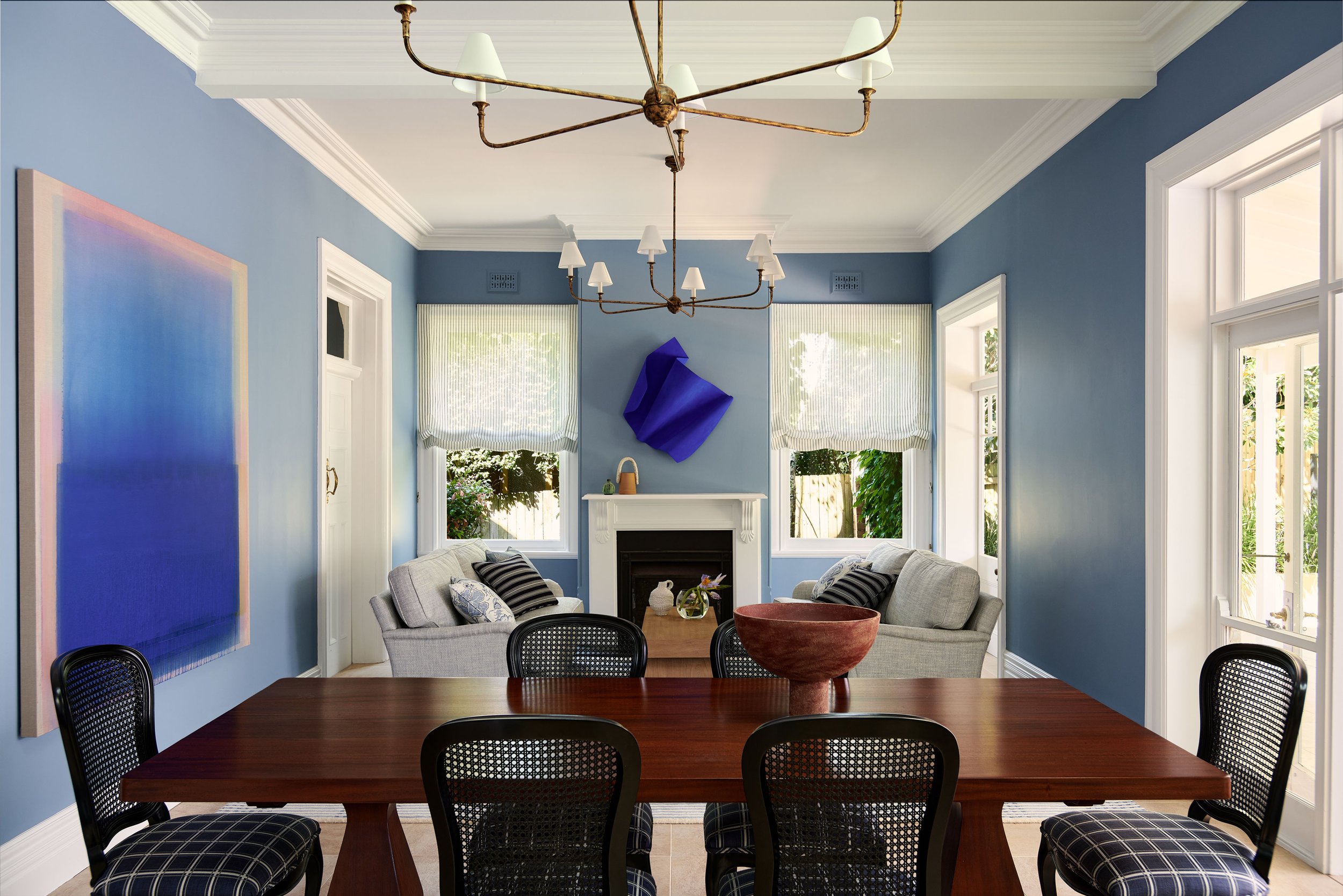
KILLARA - RESIDENTIAL INTERIOR DESIGN AND DECORATION
Where Vibrancy Enters the Palette
What makes the 2026 trend distinctive is the introduction of controlled vibrancy.
Instead of bold colours dominating a room, brighter tones appear as accents within a broader colour led interior scheme. Rust, ochre, forest green and mineral blue appear through artwork, textiles and bespoke furniture pieces, adding depth without overpowering the space.
These colours bring energy to interiors while preserving the grounded quality of earthy palettes.
Vibrancy works best when colour is layered rather than isolated. When tones echo across furniture, walls and textiles, a space feels intentional rather than decorated.
This philosophy is closely aligned with the principles explored in colour expertise in interior design, where palettes evolve in response to architecture, materials and light.
Colour as an Emotional Language
Colour does more than shape the visual character of a room. It influences how a space feels.
Deep greens can evoke calm and restoration. Clay tones bring warmth and intimacy. Muted mineral colours often create a sense of balance that allows rooms to feel both relaxed and refined.
This emotional relationship between colour and space is central to thoughtful residential interior design. Designers frequently use palette variations to shape atmosphere across the home, ensuring that each space carries its own mood while remaining visually connected.
When colour choices respond to emotion rather than trends, interiors tend to feel more personal and enduring.
This approach is explored further in the discussion around balancing colour and emotion in interior design, where palettes are used intentionally to support wellbeing and atmosphere.
Materials That Bring Earthy Palettes to Life
Colour alone rarely defines a successful interior. Materials play an equally important role in how tones are perceived.
Natural surfaces such as oak flooring, textured plaster, linen upholstery and stone surfaces amplify the warmth of earthy palettes. These materials diffuse light differently throughout the day, allowing colour to feel layered rather than static.
Because of this, many designers approach colour decisions as part of a broader interior design strategy, where materials, lighting and proportion are considered together.
During the early design planning process, palettes are often developed alongside joinery, lighting and furniture selections. When these elements evolve together, interiors feel cohesive and calm rather than assembled piece by piece.
The deeper relationship between colour, perception and space is explored further in the psychology of interior design, where subtle design decisions influence how we emotionally experience our homes.
Designing Colour Across the Whole Home
One of the most important shifts in modern colour thinking is that palettes are no longer designed room by room.
Instead, designers consider how tones move through the entire home. Subtle changes in hue allow colour to flow naturally between spaces while maintaining visual continuity.
A hallway may introduce a mineral neutral that deepens into terracotta within the living area. Bedrooms might incorporate muted greens that echo tones used elsewhere, creating a cohesive bespoke interior scheme.
In many Sydney interior design projects, this whole home palette strategy creates interiors that feel calm and architectural. Rather than competing colours across separate rooms, the home reads as a single, carefully composed environment.
Considering Colour Within the Design Process
Colour decisions are rarely isolated from the broader design process.
Understanding how palettes interact with architecture early in the project can influence both the visual outcome and the overall interior design investment required. Certain finishes or materials can elevate a palette dramatically while still remaining within practical budgets.
For homeowners planning a redesign, understanding potential interior design costs often helps clarify where colour and materials will have the greatest impact.
Many of the most effective interiors are not the most expensive ones. They are simply the most carefully considered.
Working through a professional design consultation allows colour, materials and layout to be explored together, ensuring that every design decision contributes to the final atmosphere of the home.
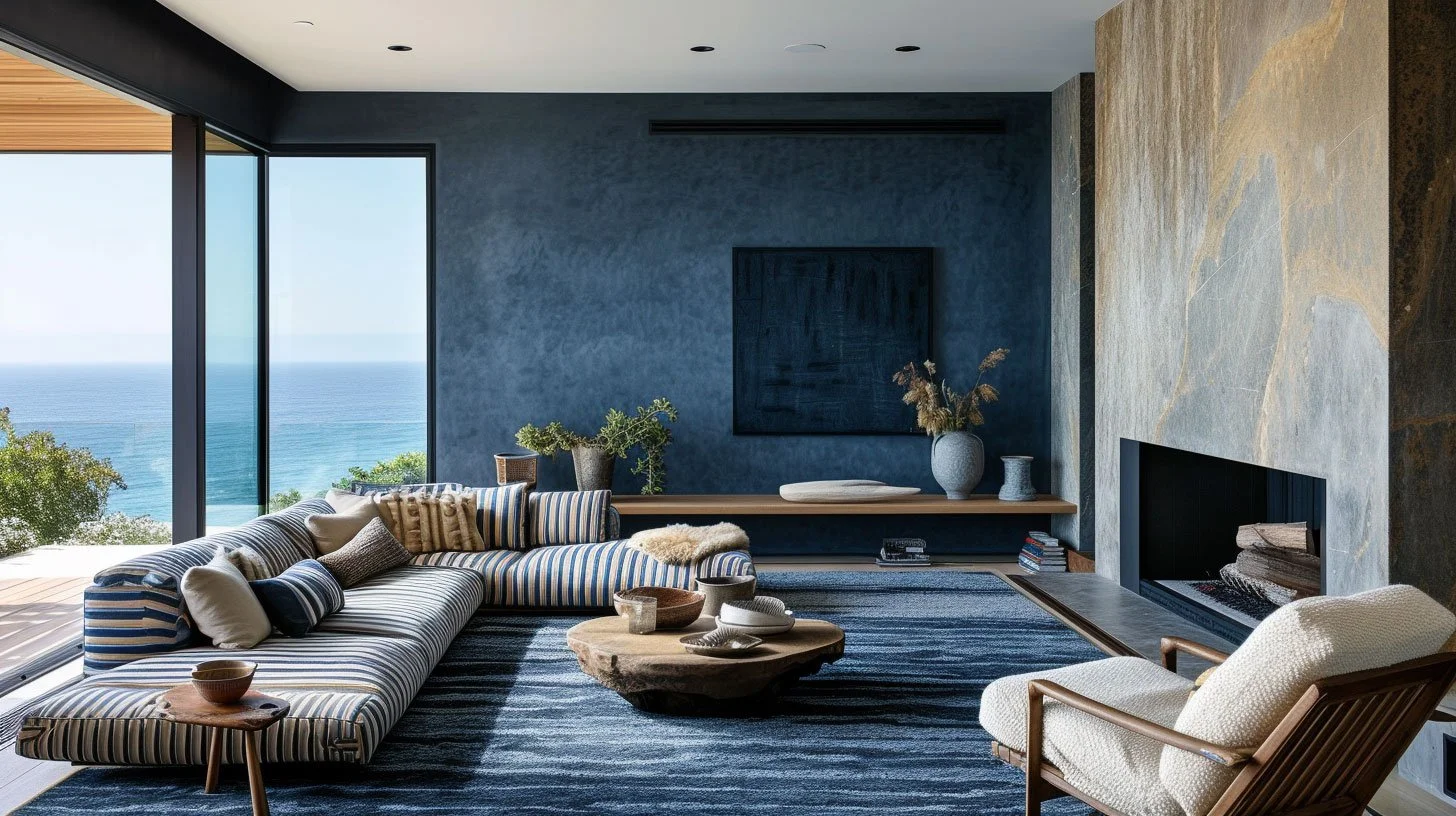
PORT STEPHENS BEACH HOUSE - RESIDENTIAL INTERIOR DESIGN AND DECORATION
Why Earthy Vibrancy Is Here to Stay
Trends inevitably evolve, but the growing appeal of earthy palettes reflects something deeper than seasonal colour changes.
Homeowners are increasingly seeking interiors that feel warm, expressive and connected to natural materials. Earth inspired palettes achieve this balance effortlessly.
By combining grounded tones with subtle vibrancy, designers are creating interiors that feel layered, timeless and emotionally resonant.
As interior design continues to move beyond stark minimalism, earthy vibrancy offers a richer and more human approach to colour in the home.
Bringing Considered Colour Into Your Own Home
Choosing the right palette is rarely about selecting a single shade. It involves understanding how colour interacts with architecture, materials and natural light across the entire home.
At Kaiko Design Interiors, colour is treated as a central design tool. Through carefully developed interior colour palettes, we help clients create spaces that feel expressive, balanced and deeply personal.
If you are exploring new home colour schemes or planning a renovation, learning more about our approach to colour led interiors, spatial planning and the wider design planning process can offer valuable insight.
Or if you would like to discuss your own project, you can contact our team to explore how thoughtful colour strategy can transform your home.