How Designers Use Colour to Create Drama Without Overdoing It

KILLARA HOUSE - RESIDENTIAL INTERIOR DESIGN AND DECORATION
How Designers Use Colour to Create Drama Without Overdoing It
Colour is powerful. Handled carelessly, it overwhelms. Handled with precision, it is transformative.
The difference between a room that feels theatrical and one that feels magnetic is not the shade itself. It is control. It is proportion. It is understanding how colour moves through space, catches light and sits against material.
In elevated interior design in Sydney, colour is never applied for effect alone. It is composed. A lacquered merlot ceiling can ground a room with authority. A restrained palette may heighten contrast more effectively than saturation ever could.
Colour as Architecture, Not Accessory
The most compelling homes do not treat colour as an afterthought layered over finished walls. They integrate it into the bones of the space.
When colour is considered as part of architectural interior design, it begins to shape proportion, hierarchy and flow. A darker ceiling can visually compress height for intimacy. A tonal shift across joinery can articulate zones without building walls. A deliberate contrast between plaster and stone can sharpen detailing.
This approach moves beyond styling. It aligns with the deeper thinking explored in colour psychology in interior design, where tone influences perception long before furniture enters the room.

DARLINGHURST APARTMENT - RESIDENTIAL INTERIOR DESIGN AND DECORATION
The Discipline Behind Dramatic Colour Palettes
Bold rooms are not spontaneous. The most memorable colour palettes for modern homes are disciplined. They are edited and that curation requires skill and practice. Our thinking around controlled expression is further explored in Kaiko’s expertise in using colour in interior design, where vibrancy is never chaotic. It is measured against light, material and scale.
Light Changes Everything
Colour is not static. It moves. Morning light flattens. Afternoon light deepens. Evening light softens.
A confident colour strategy in luxury interiors anticipates this choreography. It understands that a clay toned wall under Sydney’s coastal glare will behave differently to the same hue in a shaded Victorian terrace.
Designers do not simply choose colour. They forecast it.
When colour is selected without consideration of light, it can overwhelm. When calibrated to its environment, it creates drama without force.
Material Intelligence and Chromatic Depth
Paint is only one layer of colour.
Stone veining carries tone. Timber grain shifts warmth. Velvet absorbs. Brass introduces reflection.
In strong bespoke interior design projects, colour is embedded in materiality. It appears in fluted glass, stitched leather, oxidised steel, custom rugs and sculptural upholstery.
This layered thinking is central to crafting vibrant living spaces without overstatement. Colour lives in the texture. It moves across surfaces. It evolves through touch and shadow. The result feels rich rather than loud.
Emotional Impact Without Sentimentality
There is no fixed formula for how colour should make someone feel but there is intelligence in understanding its influence.
Some spaces require composure. Others thrive on vitality. The key is alignment between environment and lifestyle.
The deeper relationship between colour and emotional response is explored in design’s role in wellbeing, where atmosphere is not decorative but experiential.
Colour can energise a kitchen. It can quiet a bedroom. It can heighten a dining room. It can soften a study. It does not need to dominate to be powerful.
Contrast Creates Drama. Editing Creates Sophistication.
The difference between theatrical and timeless often comes down to editing.
In many high end residential interiors, drama emerges from confident moves rather than a cascade of statements. Negative space allows colour to breathe. Proportion grounds it. Material softens it.
Without editing, colour shouts. With it, colour resonates.
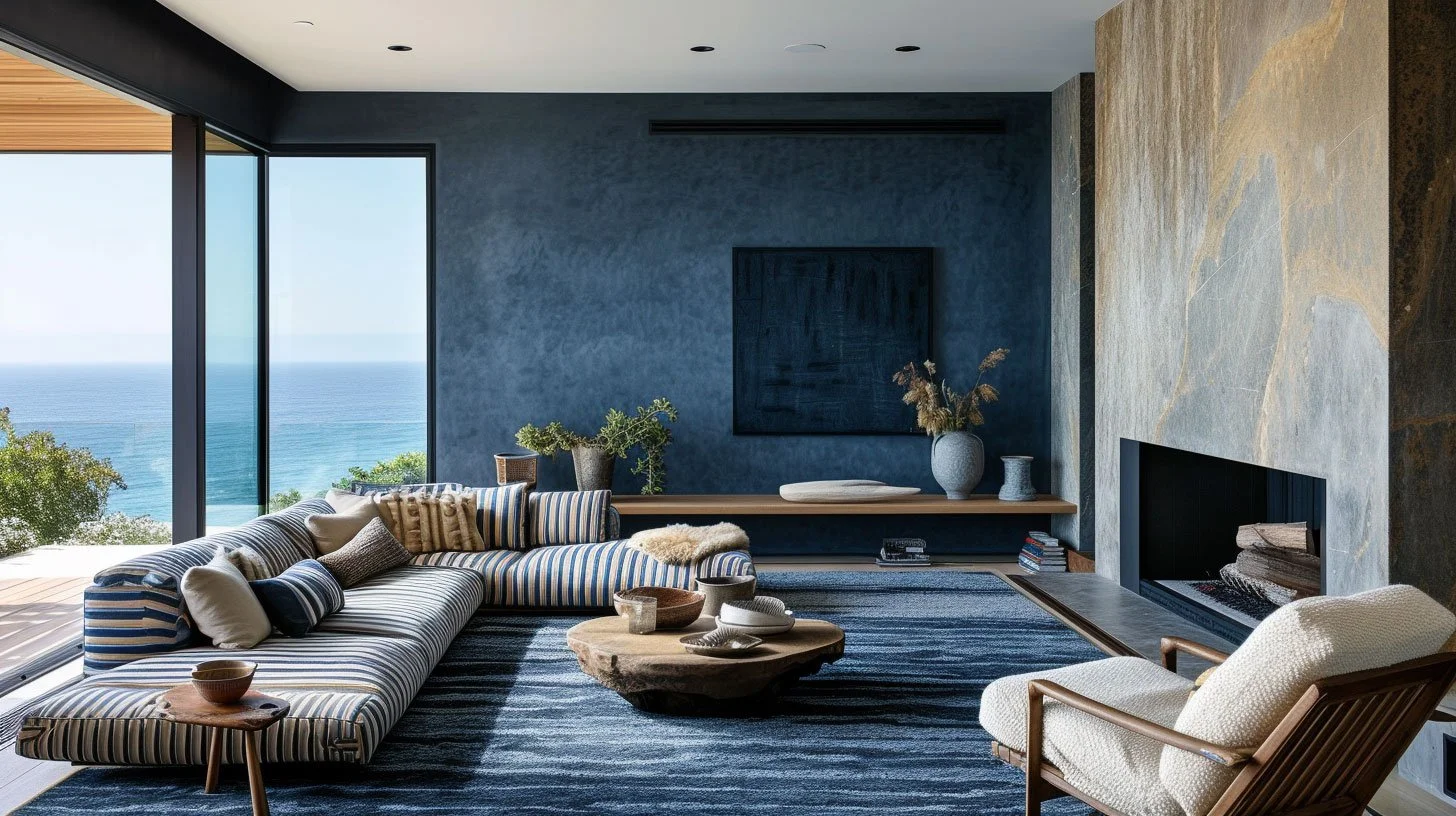
PORT STEPHENS BEACH HOUSE - RESIDENTIAL INTERIOR DESIGN AND DECORATION
The Kaiko Approach to Colour
At Kaiko Design Interiors colour is never imposed. It is composed. We consider how it will interact with architecture, light, circulation and furniture layout. We test it against texture. We review it under different times of day. We ask how it will age because real drama in contemporary interior design is not about spectacle. It is about confidence.
It is about creating homes that feel vivid yet grounded.
If you are considering how to introduce boldness into your home without tipping into excess, we welcome the conversation. Explore our interior design services and pricing or book a consultation to discuss how colour can be composed with clarity and control.