The Role of Colour in Crafting a Cohesive Design Theme
At Kaiko Design Interiors, our ethos is firmly rooted in the belief that interior design is not just about aesthetics. It's about creating spaces that resonate with individuals and enhance their daily lives. This perspective is vividly brought to life when we explore the role of colour in interior design. Colour has the profound ability to influence our emotions, perceptions, and even our behaviours. When used effectively, it can set the tone for an entire space, connecting rooms and creating that sought-after cohesive look. So, how do you use colour to achieve this unity?
How Can I Use Colour to Create a Cohesive Theme in My Home?
Colour, in interior design, is much more than just paint on the wall. It is an element that defines spaces, sets moods, and tells stories. For many, the idea of creating a unified colour theme might seem daunting, especially with the vast palette options available. However, the key lies in understanding your space and its purpose.
Start with a Base Colour
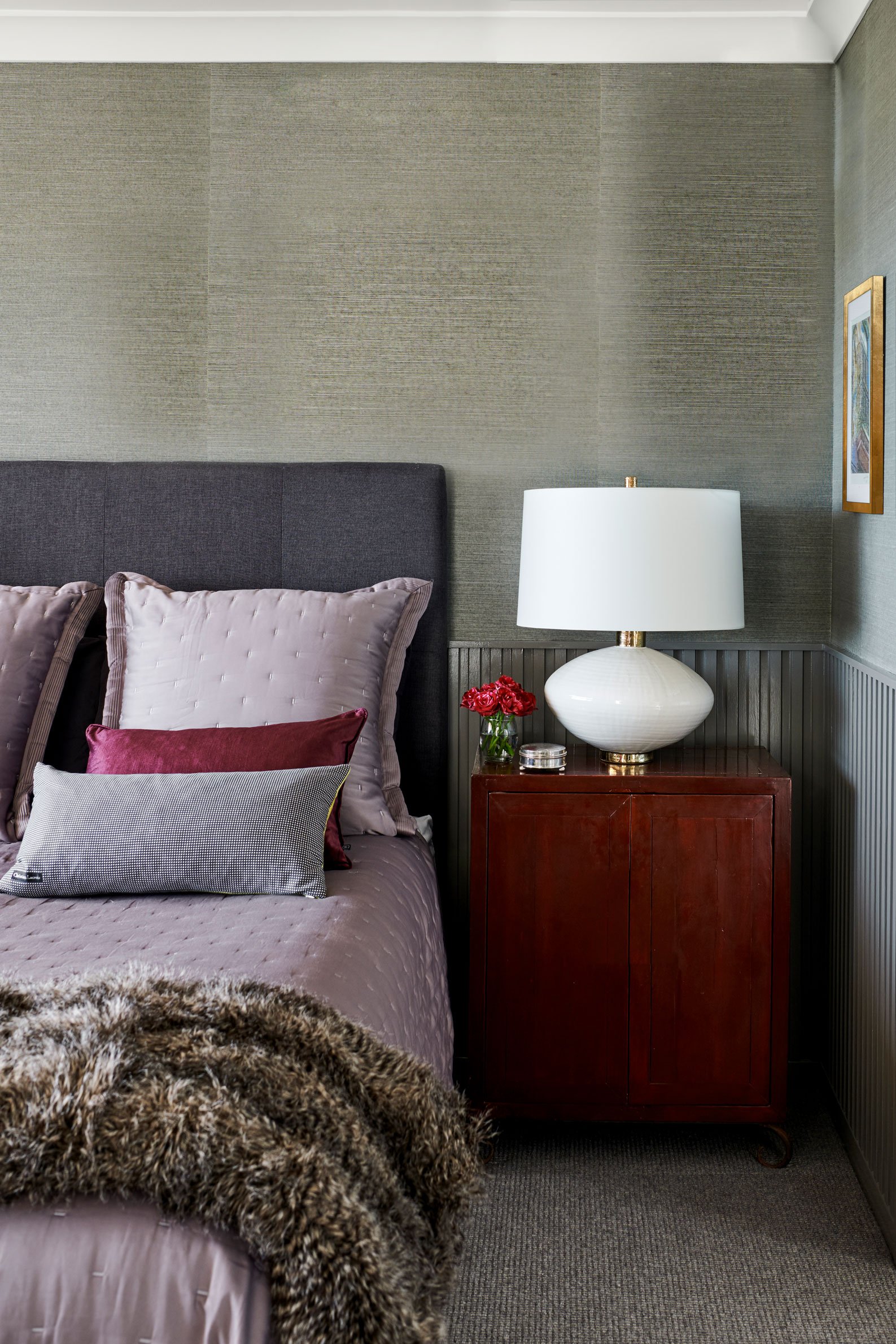
Often referred to as the 'neutral' or 'anchor' colour, this is the shade that dominates your space. It provides the canvas upon which other colours, textures, and patterns are introduced. This could be soft beiges, warm greys, or even muted blues.
Introduce Accent Colours
Once you've selected a base, think about accent shades that will complement it. This is where you can introduce bolder hues or even metallic tones. The trick is to maintain balance. Too many bold shades can overwhelm the senses, whereas too many muted tones might render a space bland.
Think in Tones, Not Just Colours
Remember, it's not just about picking shades but also considering their tones. For instance, a soft lavender and a muted olive might belong to different colour families, but if their tones match, they can cohesively exist in the same space.
To dive deeper into creating a unified look, you can read our detailed guide on From Chaos to Cohesion: Tips for Developing a Unified Interior Design Style.
What are Some Tips for Choosing Colour Palettes for a Cohesive Look?
Choosing the right colour palette is crucial. It's not just about personal preferences but also understanding the intricacies of how different hues interact.
Seek Inspiration from Nature: The natural world is full of stunning colour combinations that already exist in harmony. Think of the serene blues and sandy beiges of the beach or the vibrant hues of a sunset.
Understand Colour Psychology: Every colour evokes a specific emotion or set of emotions. For instance, blues are calming while yellows are energising. By understanding this, you can create spaces that not only look good but feel right.
Test Before You Finalise: Always test your chosen colours in the actual space. Observe them at different times of the day and under various lighting conditions.
Use Resources and Tools: There are numerous tools and apps available that can help you visualise different palettes in virtual spaces. They can be instrumental in making decisions.
For more insights, our article on How Colour Plays a Key Role in Merging Mixed Design Styles delves deeper into the subject.
How Can I Use Colour to Connect Different Rooms in My Home?
Creating a flow with colour can make your home feel more harmonious and connected. Here's how you can achieve this:
Maintain a Consistent Base Colour
By using the same base colour throughout your home, you can ensure a sense of continuity. This doesn't mean every room needs to be painted the same shade but keeping the undertones consistent can work wonders.
Vary Accent Colours by Room Function
While the living room might benefit from vibrant and energetic hues, bedrooms might call for more tranquil shades. However, having a common thread – a particular shade or tone that appears in each room – can tie the spaces together.
Use Transitional Elements
Think about how you can use doors, hallways, or even rugs as transitional elements. A rug in the living room that picks up a shade from the dining room can seamlessly connect the two spaces.
Consider Visual Lines
If you can see multiple rooms from a single vantage point, ensure that the visible colours harmonise with each other.
For a comprehensive understanding of combining different styles yet maintaining cohesion, our article on From Timeless to Trendy: The Essence of Transitional Design in Classic and Modern Decor provides valuable insights.
Avoiding Common Mistakes in Colour-Driven Design
Choosing the perfect colour palette is only the beginning. Once you’ve made your selections, it’s crucial to deploy them correctly. Making mistakes in colour application can disrupt the harmony and cohesiveness you aim to establish. Let’s delve into some common missteps to avoid:
Overcommitting to a Trend
Trends come and go. While it’s tempting to incorporate the latest shade that’s making waves in the design community, it's essential to consider longevity. Will that ultra-bright neon green still appeal to you five years down the line? Rather than splashing a trendy colour all over, consider using it in smaller, interchangeable decor items, such as cushions or artworks. For a deeper understanding of how to blend the old with the new, you might find our piece on Old Meets New: Tips for Incorporating Vintage Pieces into Contemporary Homes particularly enlightening.
Ignoring Natural Light
The same colour can look dramatically different under various lighting conditions. A room flooded with natural daylight might make a shade appear lighter, while a dimly lit space might deepen it. Always take into account the amount and type of light a room receives before finalising your choices. Our article on The Role of Window Dressings in Room Ambience: Tips and Techniques delves deeper into the influence of light in interior spaces.
Playing It Too Safe
While it's wise to be cautious, being overly conservative can result in bland, uninspiring spaces. Don’t be afraid to introduce a bold accent wall or a vibrant piece of furniture. Remember, it’s all about balance. If you're interested in blending various design elements, our guide on Blend the Bold and Subtle: A Guide to Eclectic Design Harmony provides a comprehensive look.
Forgetting the Ceiling
Often dubbed the 'fifth wall', the ceiling offers a canvas that many forget to consider. Whether you opt for a soft hue that complements your walls or a bold statement colour, the ceiling can play a pivotal role in tying a room's design together. For more on how to merge different eras and styles in design, Merging Eras: Combining Modern and Traditional Design Elements offers a rich perspective.
Finding Inspiration for Cohesive Colour Palettes
For many, the most challenging aspect of interior design is the initial inspiration. Where do you begin when there’s a world of colours out there?
Travel and Cultures: Different cultures around the world have their unique colour palettes that have evolved over centuries. Drawing inspiration from these can result in spaces that are both cohesive and rich in history. For a fusion of Eastern and Western aesthetics, you might find Bridging Cultures: Fusion of Eastern and Western Design Aesthetics an insightful read.
Nature: As previously mentioned, nature is a treasure trove of harmonious colour combinations. Whether it’s the serene blues of the ocean or the myriad shades of a forest in autumn, there’s no end to the inspiration you can derive.
Art: From classic paintings to contemporary installations, art has always been a reflection of colour trends of the times. Visiting an art gallery or even studying art movements can offer a fresh perspective on colour combinations.
History and Periods: Different historical eras had their characteristic colour palettes. From the muted elegance of Victorian times to the vibrant hues of Art Deco, there’s a wealth of inspiration to be drawn from the past. Our article on From Gatsby to Now: The Impact of Art Deco on Modern Design Aesthetics provides an in-depth exploration.
Going Beyond the Basics: Advanced Colour Techniques
Having explored the foundational aspects of creating a cohesive colour theme, it's time to delve into more advanced techniques. These methods can elevate your space, ensuring it stands out and resonates with those who experience it.
Layering Shades
One might assume that sticking to a minimal colour palette guarantees cohesion, but layering various shades of the same colour can add depth and interest to a space. For instance, using diverse blues, from navy to sky blue, can introduce visual diversity while maintaining cohesion. To get an understanding of the subtleties of merging design elements from different eras, our piece on Creating Timeless Spaces: The Fusion of Traditional and Contemporary Design can offer guidance.
Incorporating Patterns and Textures
While our focus is on colour, it's essential to mention the role of patterns and textures. They can break the monotony, add character, and still maintain a cohesive theme if they're in the same colour family or complement the primary hues in your palette. For those keen on exploring this aspect, Balancing Act: The Art of Mixing Patterns and Textures in Contemporary Design provides an exhaustive look into this dynamic.
Think Beyond Walls
Colour in interior design isn’t limited to walls. Think furniture, fixtures, art pieces, and even books. A turquoise vase on a beige table or a rust-coloured throw on a neutral couch can enhance and tie in the theme effectively. For innovative storage and decor solutions, The Art of Organising: Stylish and Functional Storage for Interiors offers a plethora of ideas.
Colour is undeniably one of the most potent tools in interior designer. At Kaiko Design Interiors, we've always believed in the transformative power of colour. It's not just about aesthetics; it's about evoking emotions, telling stories, and enhancing lives.
FAQ: Creating a Cohesive Interior Design with Colour
How can I create a cohesive interior design style throughout my home?
Start with a base colour that dominates your space, providing a canvas for other colours, textures, and patterns. Ensure a consistent base colour throughout your home for continuity, and use transitional elements like doors and rugs to seamlessly connect spaces.
How can I use colour to create a cohesive theme in my home?
Begin with a dominant 'neutral' or 'anchor' colour. Introduce complementary accent colours in balance. Remember, it's about choosing shades and their tones. Maintain the undertones consistently across rooms to ensure harmony.
What are some tips for choosing colour palettes for a cohesive look?
Seek inspiration from nature, understanding colour psychology, and always test colours in the actual space under different lighting. Also, consider using digital tools and apps to visualise potential palettes.
How can I use colour to connect different rooms in my home?
Maintain a consistent base colour throughout your home. Vary accent colours based on room function but have a common shade or tone appearing in each room to tie spaces together. Use transitional elements, like rugs, to connect different areas.
What are some common mistakes to avoid when using colour in interior design?
Avoid overcommitting to fleeting trends, neglecting the role of natural light, playing it too safe, or overlooking the ceiling ('fifth wall'). Ensure your choices have longevity and are in harmony with the room's lighting.
Where can I find inspiration for colour palettes and cohesive design ideas?
Draw inspiration from diverse sources such as global cultures, nature, art, and historical periods. Exploring different cultural aesthetics, art movements, and the natural world can offer fresh perspectives on colour combinations.