Art Deco to Mid-Century Modern: A Vintage Design Guide
PORT STEPHENS HOUSE I - OBJECTS OF DESIRE
Vintage design is one of those terms that gets applied to everything from a thrifted side table to a full Hollywood Regency fit-out — which is exactly why most vintage interiors fall flat. The reference is there. The conviction isn't. The pieces exist but they don't cohere.
Done well, vintage design isn't nostalgic. It's considered. It draws from movements that solved real problems — how to make a room feel generous, how to give furniture a sense of permanence, how to use colour without apology — and applies those solutions with a clear point of view.
At Kaiko Design, vintage-inflected work almost always sits within two dominant movements: Art Deco and Mid-Century Modern. Here's how they differ, what each demands of a space, and how to work with both without producing something that reads like a period drama set.
Art Deco: Geometry, Luxury, and the Unapologetic Statement
Art Deco emerged in the 1920s and 30s as a direct rejection of Art Nouveau's organic excess. Where Art Nouveau flowed, Art Deco snapped into line — symmetry, bold geometric form, materials chosen for presence. Lacquered surfaces. Brass. Polished chrome. Veined marble. Ebony inlay.
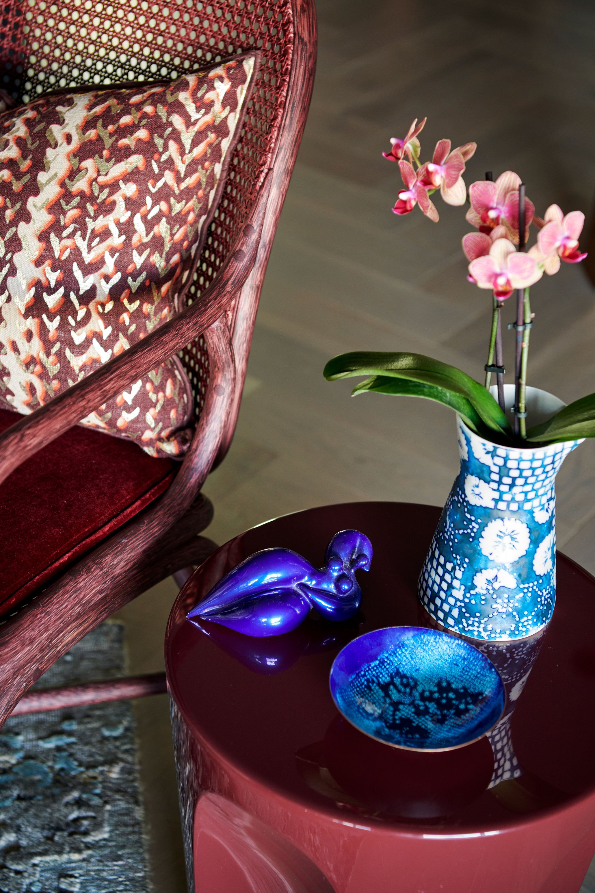
The colour language is jewel-toned and deliberate: deep emerald, sapphire, burgundy, black anchored with gold. These aren't accents — they're commitments. An Art Deco room doesn't suggest luxury; it states it.
The residential expression — what's often called Hollywood Regency — is the version most relevant to contemporary interiors. A mirrored console. A curved velvet sofa. A geometric wool rug in navy and cream. One brass pendant that earns its place. Art Deco's reach into modern design aesthetics is broader than most people realise — the movement never really left, it just became more selective about where it appeared.
The risk with Art Deco is going too literal. Stack too many motifs and it tips into cosplay. The discipline is knowing where to stop.
Mid-Century Modern: Restraint with a Warm Edge
Mid-Century Modern — roughly 1940s to 1960s — operates from an entirely different premise. Where Art Deco maximises, MCM edits. The movement was shaped by designers who believed good design should be accessible, functional, and honest about its materials. The origins and foundational thinking behind mid-century modern run deeper than the furniture silhouettes most people recognise — it was a design philosophy before it was an aesthetic.
Teak. Walnut. Fibreglass. Bent plywood. Forms that are clean but never cold — tapered legs, low-slung profiles, careful attention to the way a chair meets the floor. The palette is warmer than people remember: mustard, burnt orange, olive green, terracotta, warm white. Not the grey-washed Instagram-MCM interpretation, but the genuine article, which has far more personality.
MCM also has a distinct relationship with the outdoors — large glazing, an extension of interior materiality into the landscape. In Australian homes, this reads particularly well. The movement already anticipated the light conditions and spatial openness that define how Australians actually want to live.

PORT STEPHENS HOUSE I - DINING
Mixing Art Deco and Mid-Century Modern Without Losing the Thread
The two movements are not natural allies — and that tension is worth using, not resolving. The key is establishing one as the structure and letting the other arrive as counterpoint.
A room built on MCM bones — the architecture, the primary furniture, the tonal restraint — can handle one or two Deco statements without losing coherence. An antique brass floor lamp. A geometric occasional table. A velvet armchair that introduces a note of jewel-toned colour into an otherwise warm, earthy palette. The Deco piece reads as deliberate precisely because everything around it is edited.
The reverse — a Deco-forward room with MCM gestures — is harder but not impossible. The risk is that MCM's rationalism can look apologetic against Deco's grandeur. It takes a confident hand and usually works best when the MCM element is one strong piece of furniture rather than a suite.
Combining design elements across eras follows the same principle regardless of the movements involved: establish a primary logic, then introduce the counterpoint deliberately rather than by accumulation.
Colour is where the bridge happens. Amber, cognac, and warm caramel tones exist in both movements — in Deco's lacquered furniture and MCM's teak alike. A shared warm undertone across materials is often what makes a mixed-era room feel resolved rather than assembled.
One rule that holds regardless of the combination: don't run two graphic languages simultaneously. Choose one geometric logic per room — the chevrons and sunbursts of Deco, or the organic curves and clean lines of MCM. Both at once produces visual noise, not character.
Colour in Vintage Interiors: What Actually Works
Colour sits at the centre of Kaiko Design's approach to residential interiors — and in vintage work especially, it's where most designers make the safe choice when the bold one was available.
Muted doesn't mean muddy. Vintage doesn't mean dusty. The most successful vintage palettes tend to be built on one saturated anchor — a deep green, a warm terracotta, a navy — with surrounding tones calibrated to support it rather than compete. Vintage rooms that feel tired are usually the ones where every surface was given equal weight and nothing was allowed to lead.
Australian light, particularly in east-coast homes, handles warm vintage tones well. The ochres, burnt oranges, and olive greens of MCM respond to natural light without going flat. The cooler jewel tones of Art Deco — emeralds, deep sapphires — tend to perform better in rooms with layered artificial lighting or deliberately controlled natural light.
Texture amplifies colour in vintage interiors more than in almost any other style. Velvet, boucle, rattan, rough linen, polished timber — each shifts how a colour reads across the day. This is worth resolving before committing to any palette.
What's Actually Relevant in Vintage Design Right Now
The conversation has moved. Sputnik chandeliers and Edison bulbs had their moment — that moment has passed.
What's current: burl wood surfaces, which bring organic patterning and warmth that no engineered material replicates. Curved forms — the soft arc of a sofa back, a rounded archway — that echo Deco's geometry without its rigidity. 1970s Italian design, particularly pieces from Cassina and B&B Italia, which occupy a productive space between MCM's rationalism and Deco's material confidence. And travertine, used not as a trend gesture but as a grounding element with genuine age and weight.
The broader shift is toward the antique dealer's eye: one genuinely aged, genuinely considered piece can anchor an otherwise contemporary room more effectively than an entire suite of vintage-inspired furniture. Provenance and specificity over theme. Incorporating vintage pieces into contemporary homes is less about period accuracy and more about understanding which piece has enough presence to hold the room.
How Kaiko Design Works with Vintage Interiors
Vintage-inflected work at Kaiko Design is always bespoke — built from the specific character of a project, not from a mood board category. Port Stephens House I is a useful reference point: objects with history and weight, colour used with confidence, a room that feels collected rather than decorated. That quality — of curation rather than decoration — is what separates vintage design that endures from vintage design that dates.
The starting point is always the architecture. What is the room asking for? What is the light doing? What does the building's own history permit or suggest? The movement comes second. Sourcing comes last.
To understand how bespoke interior design at Kaiko Design is structured and priced — and what the process looks like from first conversation through to installation — the pricing page sets out the detail.
Ready to Work with Vintage in Your Own Space?
Whether the brief is a single room or a full home, Kaiko Design works with clients across Sydney and nationally to create spaces that are specific, enduring, and grounded in real design thinking.
Start the conversation here — or explore the residential portfolio to see how vintage-inflected work sits within Kaiko Design's broader practice.